Nobel Crown
INDUSTRY: Natual Hair and Loc Services
SERVICES: Logo Design for print and social media.
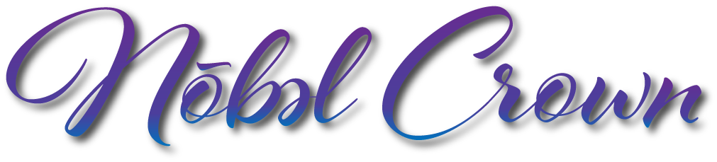
Typography
A handwritten cursive script was selected to function as a personal signature from the owner herself.
This choice symbolizes:
A personal promise
Consistency and care
The commitment to walk alongside clients through every stage of their loc journey
The typography reinforces intimacy while balancing the strength of the crown mark.
Color/Tone
Gold tones were used to communicate value, excellence, and royalty, while cooler gradient hues introduce calmness and trust. Together, the palette balances empowerment with approachability.
The overall tone of the brand is:
Regal · Feminine · Strong · Inviting · Professional.
Project Overview
Nobel Crown is a natural hair and loc styling brand built on trust, care, and personal connection. The client approached me after seeing several of my design works displayed throughout Downtown Detroit during my time at Rocket Mortgage. She was seeking a visual identity for a business she felt deeply called to, one she believed she was destined to do.
As a loctician, her relationship with clients goes beyond styling. It requires patience, trust, and emotional investment. The brand needed to reflect strength, professionalism, and warmth, communicating that she could hold that deeper connection while remaining inviting and credible.
Concept/Inspo
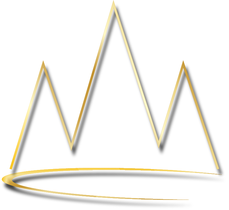
The crown became the foundation of the identity, symbolizing self-worth, pride, and the idea that natural hair is one’s crown.
To maintain authenticity, the crown was intentionally hand-drawn rather than geometric. This approach mirrors the care and effort required to individually hand-roll locs, reinforcing the hands-on nature of the craft.
The three crown points draw inspiration from a mountain range, representing the unparalleled journey of growing locs, one that requires patience, guidance, and trust between client and loctician.